
Every pay period your employees receive information about their compensation, but do they really see the whole picture? While pay stubs include information on an employee’s salary, there are additional benefits the company pays for that are not included. Total compensation statements give employees a better overview of everything your company provides for them – but how do you use them effectively?
1 – Highlight your best assets
One of the biggest keys to a strong compensation statement is showing off what makes your specific benefits package unique. Does your company subsidize a large portion of employee healthcare costs? Do you offer a robust retirement matching plan? Do you offer unique perks such as flextime or unlimited PTO? Utilize the layout of your statements to highlight these items. Think about including information in a callout or “Did you know?” section to provide additional information on these programs to your employees. Your statement can encourage participation in programs provided by the company, or remind them of upcoming events. They are also useful to inform employees of lesser-known benefits they may not be utilizing.
Additionally – consider providing comparisons to market data to further illustrate the strength of your benefits. The Society for Human Resource Management generates yearly surveys that evaluate benefits and provide a great resource for comparing your company to the national average.
2 – Utilize Graphs & Charts
Charts and graphs are a useful visual for illustrating patterns and relationships within your compensation statements. Pie and bar charts are most common, but a variety of charts can be utilized to highlight the value of your benefits. Illustrating is a great way to provide a visual, easy-to-digest format for employees to evaluate their data and communicating important information. However, it is also important to consider the different chart types and whether they make sense for the information:


Pie charts are one of the simplest and most efficient charts, and commonly show the distribution of benefits – for example, Healthcare vs. Insurance vs. Retirement benefits. It shows HOW benefits are being used. Are you contributing heavily to their healthcare costs, or are you more focused on robust retirement matching? These charts are very versatile and communicate benefit information quickly and effectively.
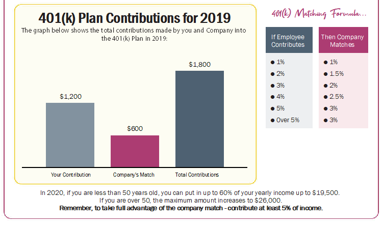


Bar charts, like pie charts, show the distribution of benefits – but more commonly, they compare values across categories. The comparison of cash compensation, paid time off, and benefits is one common usage for this chart, as well as showing the potential growth over time of a retirement account.
The important thing to ask is what type of data do you want to show on your compensation statements? Are you comparing values, or seeking to show the composition of a whole? When considering your charts, also remember to keep it simple. Present the essential information clearly and effectively – more complex charts are harder for the reader to understand.
3 – Don’t forget about hidden benefits
Just because they may not have a dollar value does not mean that certain benefits do not provide value. Highlighting cultural features of your company reminds employees that there is more to their compensation than just pay and benefits. Flexible work hours, work from home options, and career development opportunities are highly sought-after perks that employees look for. Putting these benefits in front of employees is a great way to remind them how much you offer!
The best way to maximize your statements is to have a clear picture of your goals and share them with your project manager! We can help customize your statement to maximize the value of your benefit package and show employees the extent of their compensation!


Comments are closed.